
Varsom Product research and targeted app redesign
Crowdsourcing needs a crowd
In Norway, avalanche forecasts keep people alive in the mountains. A handful of forecasters build them from field observations that skiers send in through Varsom. But thousands open the app all season to read the forecast, and almost none send anything back. That data drought caps how good the forecast can get — and how safe the mountains are.
Problem
The crowd’s already here. The app gives it nowhere to go.
Every winter, thousands of backcountry skiers check Varsom before heading out. The forecast they’re reading is built from observations that people exactly like them send in from the field. Almost none of them do.
The easy assumption is that people can’t be bothered — that you’d have to build the willingness from scratch. The research said the opposite. The will to contribute was already there.
So this was never a motivation problem. It was a plumbing problem. The app gets opened constantly; the contribution almost never happens — and it leaks at three points.

7 in 10 assumed reporting wasn’t for them
Most people didn’t know reporting was possible at all. Of those who did, 70% assumed it was a job for professionals — even though they’d taken avalanche training themselves.
A wall of fields, all secretly optional
The form mixed quick field notes with advanced scientific inputs in one flat structure, and hid the fact that every field is optional. Novices read it as an exam. Experts read it as noise.
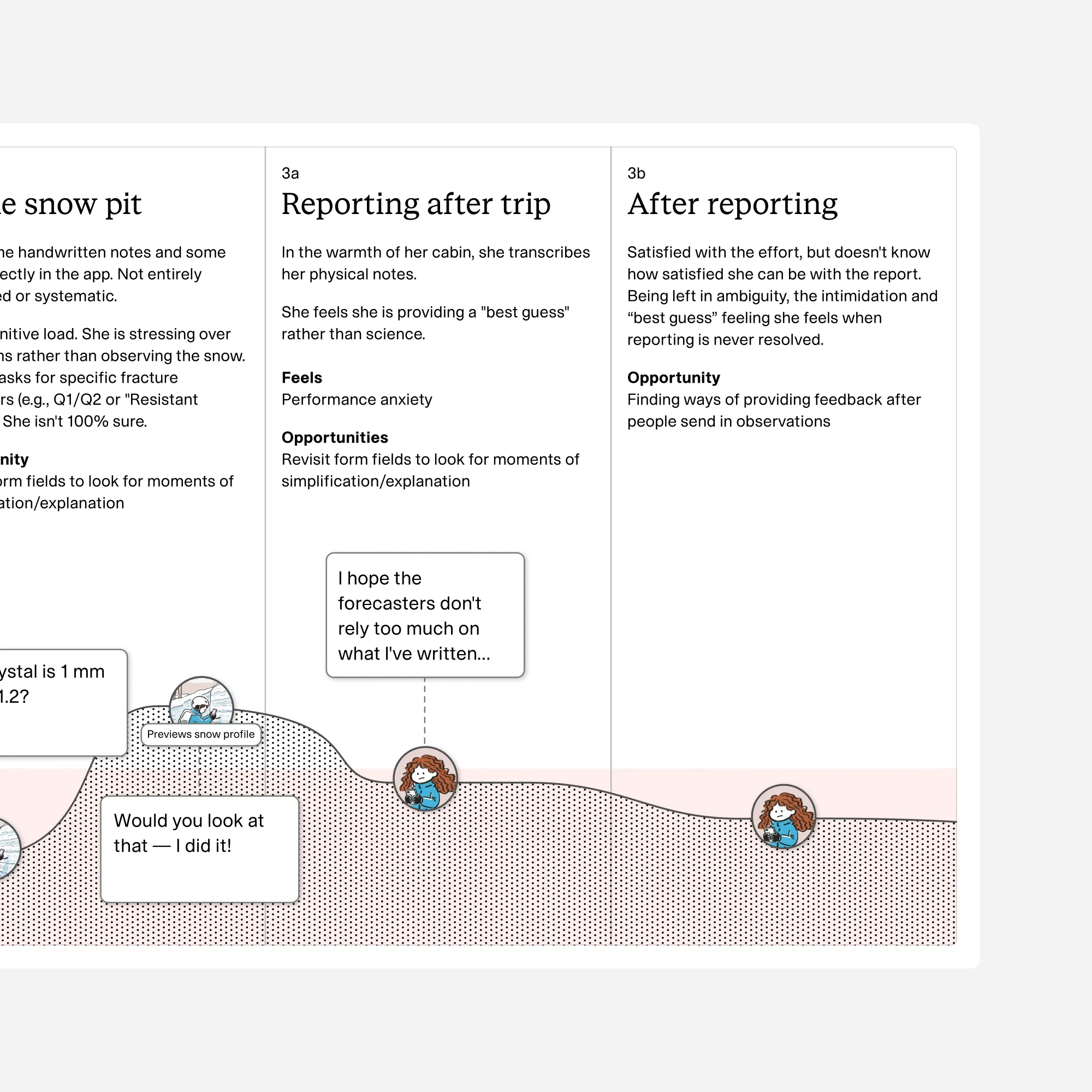
You report into a void
The few civilians who pushed through were doing it out of genuine care. The system gave them nothing back — no sign a human ever saw their work. So the most promising contributors were also the most likely to quietly stop.
These three leaks aren’t abstract. Each one is a real kind of person, and naming them is what let me decide where to push.
Rabbit holeThe three people the funnel loses
Three personas came out of the research. Their job wasn’t decoration — it was to force a prioritization.
Daniel has the app and uses it like a weather forecast. He doesn’t know it’s a two-way tool. Told that it is, he assumes the reporting side is for scientists, not him. He’s the biggest group by far, and he’s the discovery leak.
Selma took an avalanche course last season and feels a real duty to contribute. But every submission feels like a high-stakes test she might fail, and with no feedback, she never learns she’s doing fine. She reports a fraction of what she could. She’s the activation leak — and the one most at risk of churning out entirely.
Arian is a paid expert. He knows exactly what he wants to say and finds the form’s rigid structure gets in his way. He’s built workarounds — handwriting notes to type up later, buying a stylus so he can report with gloves on. He’s tolerant of a bad form because he’s embedded and on payroll. He’s the leak I chose not to chase.
Approach
First I learned the world. Then I found out where it was breaking.
I did this alone, in stolen hours around a full-time internship, starting out knowing almost nothing about snow science. [your take? — the real texture here is yours: context-switching cold into avalanche terrain for a short work session, then straight back to the internship, often without notes to pick up from. Say what that actually felt like.] That pressure shaped everything downstream. It’s why the research had to be efficient, and why I had to be ruthless about what to chase and what to leave alone.
The method order wasn’t a checklist. Each step existed to answer the question the last one raised.
I started by immersing in the domain — NVE documentation, forecaster podcasts, the app itself — because as an outsider I hadn’t earned the right to interview anyone yet. Ask a professional observer a naive question and you waste the interview.
Then six , because in an ecosystem with almost no prior user research, I needed to hear what themes even existed before I could measure anything. The interviews gave me the hypotheses.
Then a 65-person survey to test how widespread those themes were — and to reach the non-users interviews couldn’t, branching them into why they never report.
By then it was clear the form itself was part of the problem. So I ran collaborative walkthroughs with active observers. Heuristics had already shown me that the form was broken; the walkthroughs told me which fields to cut, keep, or rebuild — with , so changes wouldn’t collide with how forecasts actually get made.
Usability tests came last, with five participants, because you can’t test a redesign until you’ve earned your way to one.
Some of what I was designing for — sustained motivation, actual behavior change — can’t be proven without a live launch. So instead of pretending five sessions settled it, I wrote down what a real deployment would still need to test, and handed that over too.
Rabbit holeDoing research in an AI era
This ran alongside a full-time internship, in a domain I didn’t know, with no team. AI tools filled parts of that gap — but the division of labor is the whole point.
ChatGPT held the project’s working memory. I kept all the context in one place and used it as a standing sparring partner: stress-testing my domain assumptions, comparing candidate directions while scoping, and — because sessions were short and scattered — reminding me where I’d left off when I hadn’t left myself notes. Claude did the heavy synthesis, including turning the hand-catalogued form inventory into the interaction cost analysis. Gemini wrote prototype code. Image models made visual assets.
What AI didn’t do: talk to users, decide what mattered, or notice what was missing. And the real risk was never hallucination — it was plausible overclaiming. Drafts kept drifting toward conclusions the evidence didn’t support, and a language model will amplify that drift eagerly. The most useful habit I built was interrogating every claim with one question: is this a finding, an applied rationale, or a hypothesis? Most of the honesty caveats in this case study exist because of that question.
Strategy
Three leaks, three people, one place to push.
The research collapsed into a simple map: three leaks, three faces, and one decision about where the effort should go.
That map told me where not to spend it. Arian — the paid expert — is embedded and highly tolerant of the current form. Optimizing for him would be the comfortable mistake: satisfying to do, low return. The leverage is everywhere else. Daniel, because he’s the biggest group by a wide margin and doesn’t even know the door exists. Selma, because people like her are rare, high-value, and the most likely to quit before they get good.
Then a second pass, on the how. I mapped every possible change on effort against impact, and the useful surprise was that most of the high-impact fixes were cheap — basic interaction hygiene, not new features. That’s what pointed me at three moves instead of three hundred.
Rabbit holeHow I picked what to build
I put every candidate intervention on a 2×2 of effort versus impact, then grouped related changes into clusters.
A lot of the high-impact work turned out to be low-effort: swapping dropdowns for chips, replacing keyboard number entry with steppers, hiding fields a given user doesn’t need. Cheap to build, cheap to test, and they cut real friction. That shaped the whole prioritization — instead of betting on complex new features, I focused on foundational fixes I could validate quickly against the large dormant user base, leaving a clean foundation to iterate on once there’s real usage data.
Solution
Make it visible. Make it doable. Make it worth it.
Three moves, each aimed at one leak.
Surface it
Fixes the discovery leak (Daniel). I overhauled the entry points and added priming copy so the reporting feature is actually seen — and so it reads as something civilians do and forecasters want, not a professionals-only club.
Simplify it
Fixes the activation leak (Selma). I replaced the flat wall with a hierarchy: quick notes separated from advanced science, fields revealed only when relevant, and the structure chunked around concepts people already learn on avalanche courses (the avalanche triangle) — so filling it out doubles as practice. This is where the friction lived, and where the effort model earned its keep. It’s also the change that quietly turns reporting into a learning tool.
Close the loop
Fixes the retention leak. A notification when a forecaster opens your observation — small, but proof your report reached a human. This is the one solution rapid testing couldn’t validate, so instead of claiming it, I documented the pain points and recommended paths for NVE, grounded in Self-Determination Theory.
The clearest picture of the friction isn’t a chart. It’s Arian buying a stylus and a power bank so he can keep his gloves on and still fight through the form — an expert engineering his own way around the tool that’s supposed to help him. Fix that, and you’ve fixed something for everyone below him too.
Results
A small crowd, an early signal, an honest scope.
Context first, because it changes how the numbers read. The contributor pool is tiny — around 100 paid observers nationally, and a thin layer of could-be contributors behind them. Against a population that small, testing with a handful of real observers isn’t a shortcut. It’s the right instrument for the questions I was asking.
5 of 5 understood the feature
Every usability participant understood what reporting is and that it’s meant for them. The entry hesitation from earlier walkthroughs didn’t show up.
5 of 5 completed every task
All five finished each reporting task and described the flow as easy and intuitive.
31% less interaction effort
By a custom effort model, a typical comprehensive report drops from ~669 to ~463 interaction points. A directional comparison for design triage — not a precise metric.
Still works for experts
Collaborative walkthroughs with active observers confirmed the simpler patterns still support professional workflows.
Where this stops, plainly: the biggest prize — activating the large dormant majority — is a behavior-change claim, and behavior change needs a live launch. I didn’t test that with five people and pretend otherwise. It’s the core of the deployment protocol I handed NVE: A/B frameworks, conversion tracking, longitudinal retention.
Rabbit holeMeasuring effort: what my model borrowed, and what it broke
The interaction cost model started as a communication problem: I needed to compare the current and redesigned forms with NVE in terms more concrete than “it feels simpler.”
The method: I catalogued every form field in both versions by hand — input type, conditional logic, repetition patterns. Each input type got a weight in interaction cost points, informed by walkthrough sessions where active observers narrated which interactions felt effortful, a small branched survey of experienced reporters rating per-section effort, and the interview data. A chip costs 1p. A keyboard numeric input, 3p. Extended free-text composition, up to 16p. A location pin on a map, 10p. Summed across realistic scenarios, a typical comprehensive observation drops from ~669p to ~463p — the 31% — and the effort gap between a quick and a comprehensive report narrows from 56× to 26×, which matters for anyone weighing the climb from casual to serious contributor.
Then I asked whether the model was any good, and fell down a hole. It turns out HCI has been trying to measure interaction effort rigorously for fifty years, and the field is split down the middle on how.
One tradition predicts effort before anyone touches the design. Card, Moran and Newell’s GOMS and its stripped-down cousin the Keystroke-Level Model decompose a task into primitive operators — keystrokes, pointing, mental preparation — each with an empirically measured time constant. Point at a target and Fitts’s Law tells you, to the millisecond, how long the movement takes as a function of distance and target size. These models are the gold standard for a reason: cardinal, validated across decades, runnable on a wireframe. But they buy that rigor by modelling a narrow slice of reality. KLM assumes a skilled user performing without errors, and collapses all of thinking into a single ~1.35-second “mental operator.” Fitts covers the finger, not the mind.
That’s fatal for a form like RegObs, because its real cost was never in the tapping. It’s in deciding what you observed and which field it belongs in — translating a hunch about the snowpack into the system’s categories. That’s Norman’s gulf of execution, and it’s exactly the cognitive load the predictive models wave away with one constant. Measure RegObs with KLM and you’d conclude the hard part is cheap.
The other tradition measures effort after the fact, from the person who felt it. NASA-TLX asks users to rate a task across mental demand, physical demand, temporal demand, performance, effort and frustration — capturing precisely the cognitive and affective weight the objective models miss. The catch is symmetrical: it needs real people doing real tasks, so you can’t run it on a design that doesn’t exist yet. Nielsen’s “interaction cost,” the practitioner phrase I’d borrowed the name from, sits deliberately loose — the sum of mental and physical effort, no unit, no formula.
My model is a hybrid, and its flaw lives exactly on the seam. I took ordinal data — perceived-effort rankings from the experiential tradition — and did arithmetic on it, summing and ratioing as if it came from the predictive one. Stevens’ measurement theory is blunt about this: ordinal scales support order, not addition. “3p is harder than 1p” is a legitimate ordinal claim; “3p is three times 1p” and “463 is 31% less than 669” quietly promote it to a ratio scale it was never built on. So the 31% is directionally defensible and metrically fictional at the same time. The model also predicts no completion times, has no statistical validation, and conflates motor with cognitive effort — the very conflation the two canonical traditions exist to keep apart.
There’s a blunter truth under all this, and it took me a while to let myself say it. The form was obviously broken — made once, forgotten, never revisited. You don’t need a validated instrument to measure a thing with a hole in it, and reaching for one risks spurious precision on an object that never earned it. The trap in “obvious,” though, is the question it invites: if it was so plain, what did I actually do? The answer is that obvious and trivial aren’t the same. The form had been normalized by the people closest to it — its brokenness was masked by neglect, not by subtlety. Re-seeing what everyone had stopped seeing, and quantifying it just enough to make it undeniable, was the work. The obviousness was a finding, not a given.
So why keep it? Because its actual job was never prediction. It was comparison and communication — persuasion-grade rigor for a problem that was already plain — and for that it earned its keep twice over. It triaged design decisions, pointing straight at the temperature and density layer sections, whose per-entry costs compounded worst across repeated entries. And it gave stakeholders a single number to argue over, which prose about “friction” never achieves. The lesson isn’t “the model was wrong.” It’s that rigor should match stakes: effort measurement forces a choice of tradition, and the honest move is to pick the one your question actually needs — or, if you’re going to straddle them like I did, to say so out loud rather than let a clean-looking percentage imply a precision it doesn’t have.
Learnings
Match the rigor to the stakes.
The through-line of the whole project: I spent effort where the leverage was, and I said out loud what I hadn’t earned.
The effort model is the clearest case. The form was obviously broken — built once, forgotten, never revisited. You don’t measure a thing with a hole in it to three decimals, and trying to would have been the real error. [your take? — this is the honest, human version: the surprise of building a scrappy little model to make a point, then falling headfirst into fifty years of HCI measurement theory because you got curious about whether it held up. Write what that actually did to you.]
Same discipline everywhere else. The parts I couldn’t prove — motivation, retention, behavior change — I scoped honestly and handed over as a testing protocol instead of dressing them up as results. A thin honest claim beats a padded one, and pretending five people settled a question about thousands would have been the fastest way to lose a reader who knows better.
[your take? — one line on what this project revealed about you as a designer. Not the polished version. The real one.]