Days Product Design
A Social App for Social Health
I explored the ways social media could better nurture its user’s social well-being. This involved diving into the psychological research, and surveying and interviewing the steadily increasing cohort of tech-averse young (18-32) users. The result was Days — a calendar-based social platform for social planning. Since its completion, other social planning apps (Apple Invites and Partiful) have garnered widespread attention, validating the insights and the resulting concept.
Problem
Digital social interaction is best when it’s intentional
I interviewed and surveyed 30 tech-averse users. Key themes emerged in their answers.
- Digital social interaction is best when it’s intentional.
- Digital social interaction should facilitate physical social interaction.
- Social media today does none of these things. It is designed for us to passively scroll, and a shrinking proportion of features are focused on bringing people together.
These findings were supported by secondary research, like this paper suggesting that the social media experiences most conducive to well-being are driven by intentional interactions, not by filling idle moments with passive entertainment. It is interesting, then, that Meta on average in 2025 only show posts from users friends 7 % of the time.
Rabbit holeHow i got there
Desk research. I read about digital social interaction and its potential to contribute to social well-being. This made me focus on social media and social planning.
User research. I gathered qualitative and quantiative data from 32 people. This included six semi-structured interviews, and surveys asking people to rank social media features based on their perceived contribution to their social lives.
This is synthesized in two personas, a user journey map, and several user flows to gain clarity on typical behavioral tendencies, what pain points exist, and where along the journey they occur.
I should note that I involved this group continuously. This helped me uncover the problem initially, and validate and iterate on the concept later.
Solution
To make it more intentional, I ideated on compelling ways to remove all interaction patterns conducive to passive interaction
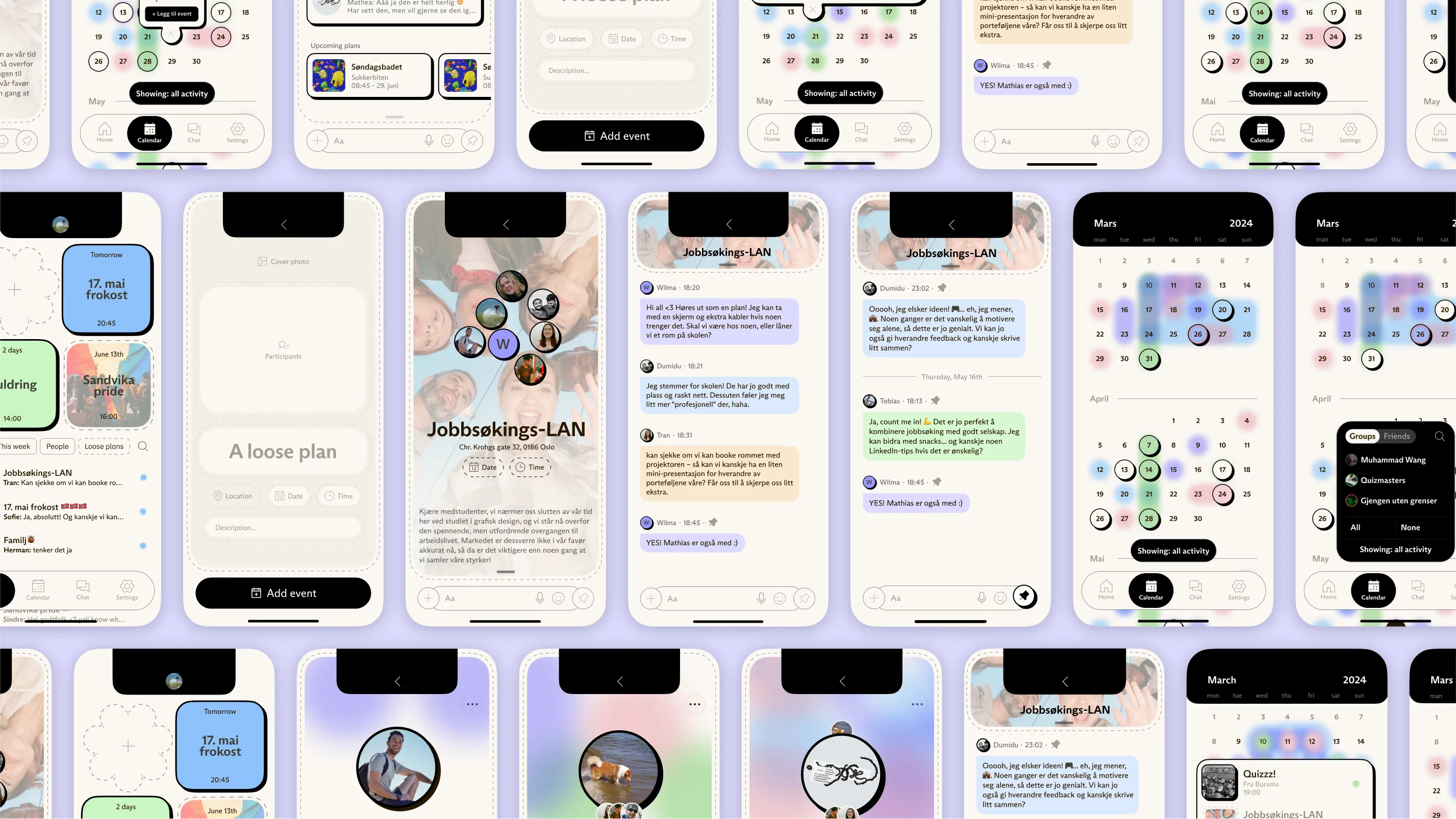
The dashboard centers social planning completely, only displaying upcoming events and recent conversations. This make for a lightweight, intentional app experience.
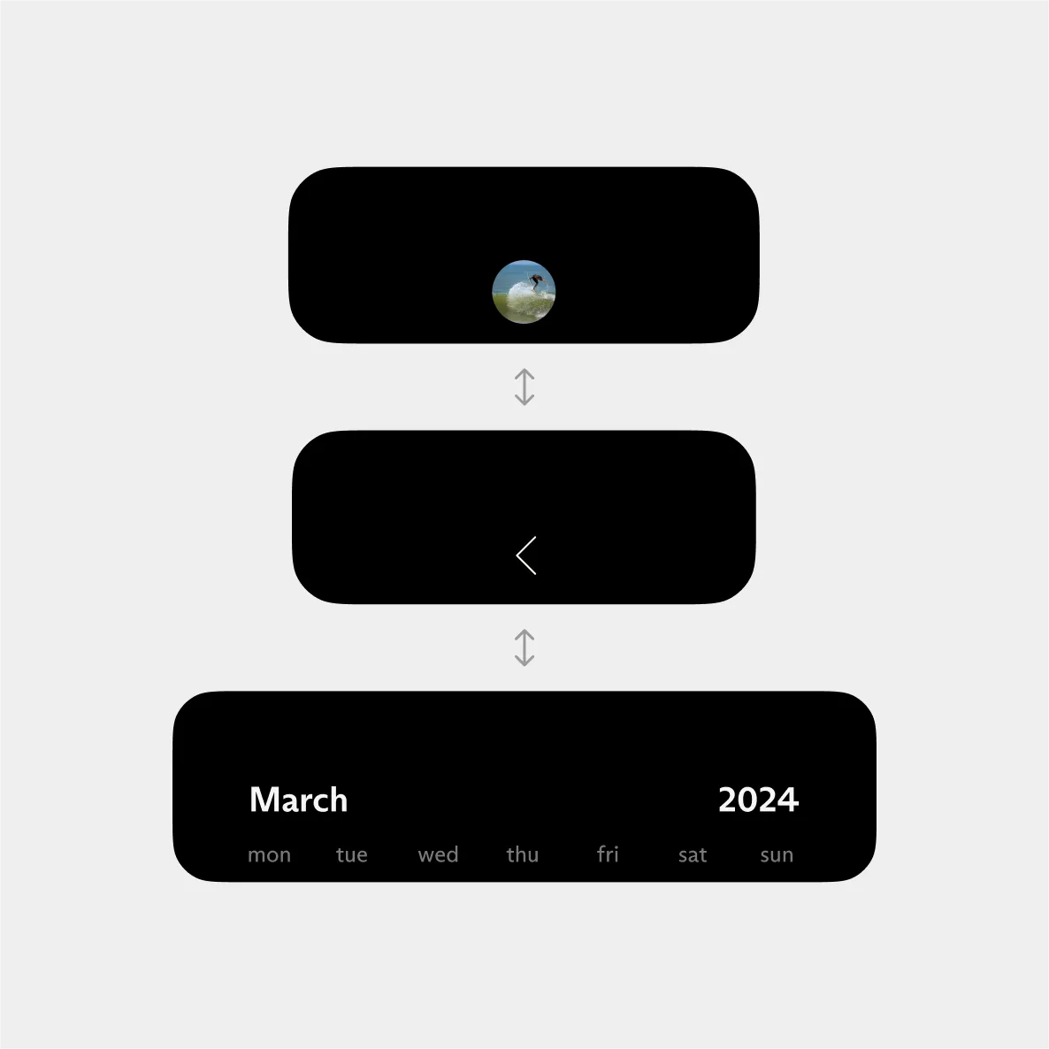
The profile lives inside the extended notch. Including only name and image, it is only enough information to be useful identifier. It is purposefully lightweight to avoid social comparison and profile fixation, which is one of the main aspects of social media is associated with negative mental health outcomes.
Furthermore, the extended notch section is a graphical add-on to the iPhone notch, accounting for the size variability across models, and bringing “dynamic island” functionality to older models — which this cohort of users tended to have.
The new pattern intimately connects chats and events. Focusing most user testing on this, I found that the inherent usability issues with brand new patterns was more than componsated for by the learnability and the delightful “aha-moment” users expressed upon testing.
:::dive [How i got there] Benchmarking With a solid user foundation, I audited existing tools to identify essential features beyond the feed. I mapped core user flows, focusing on tasks like creating a plan and confirming a date, ensuring each task could be completed with minimal steps.
Iteration I quickly moved into wireframing to test structural choices, iterating through rapid usability sessions to ensure the design remained aligned with user needs. After confirming the flows I refined the prototype into mid- and high-fidelity versions, continuing usability testing to keep the solution true to user intent.
Brand identity For the final presentation of the project, I undertook a brand process as well. Muted colors, whitespace, soft motion, and humanitst typography with moderate x-height make Days feel like its at the edge of Silicon Valley aesthetics, making its challenger role self-evident, appealing to the target group by reinforcing the product’s promise. :::
Learnings and Acknowledgements
Challenging mental models
One of the biggest learnings was the success of interlocking events and chats. Initially, this decision seemed risky due to its novelty, but after testing, users had an “aha moment” that made the experience intuitive and engaging. This was a reminder that innovative design often requires cognitive effort, but if it’s learnable, it can create impactful moments.
Cross pollination between product/service offering and brand
By working on both the brand and the product at the same time, I noticed how the animations, the visual rythmn, and the UX copy impacted the brand perception as well, not just the user experience with the product.
Coming from a graphic design background, I think an appreciation for brand is helpful when creating products/services.
In some ways this is an obvious overlap, however in practice I my impression is that a lot of companies are keeping brand and product separate, operationally. In reality I think they’re concerned with the same thing; the experience people have.
Therefore I think you can get interesting places by allowing the nature of the product directly impact the brand, and vice versa.